
Hello adventurer!
A black & white game where a Camera is your only tool to explore a cute & quirky world! But how does the design communicate where to go, and points of interest if the UI doesn’t use colors, the art style is flat 2D, and there is no flashy vfx to draw attention? Wait, wouldn't that make the UX too subtle & confusing?
How do you make a game clear and easy to understand when you can’t use colors to make things stand out, or show what things are or what state things are in?
Toem is a fun and cute game that shows that you don’t need to design with color!

ENVIRONMENT DESIGN
1. The ground is always light
In a world of grey, it has to be clear what you are looking at, or else the visuals become a grey mess that all melts together. They make it clear where you can walk and what areas you can get to by consistently having the ground in a light grey. This makes all the characters, walls, buildings, trees and rocks stand out because they are always darker.
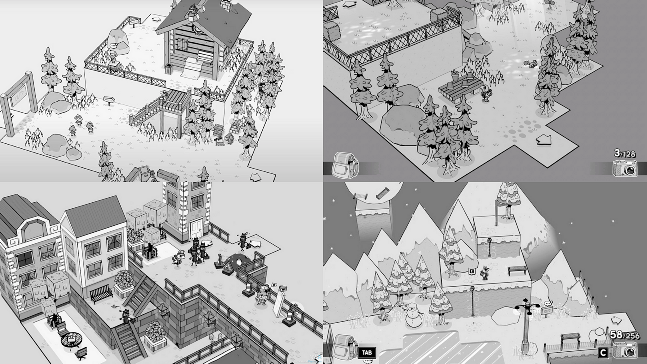
The ground is light on all levels across the game.
2. Arrows pointing the way
To make it clear where the main paths between maps are, the levels have clear ‘folds’ sticking out outside of the otherwise square map shapes. These main paths between maps also have a big arrow pointing the way, making it super easy to see. The arrow is the same shade of grey as the ground color of that map, but with a sharp black outline that adds a little of a 3D look to stand out from the environment.
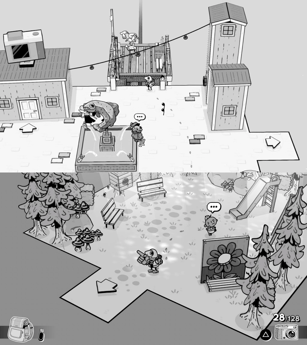
Arrows pointing the way between map levels.
3. Stairs
As you progress in the game, the layouts and complexity of the environment get a little bit buzzier (not by a lot, it’s still kept fairly simple). However, the navigation in the game is still clear, with the pattern of stairs on all maps. They are wide, dark colored, and follow a pattern of stripes or cross netting.
Consistency: The design of the stairs doesn't change much between maps, so they are always recognizable as walkable areas. They are wide, on the same angle, and placed to be seen clearly. (There are no hidden placements, which would make them difficult to spot.)
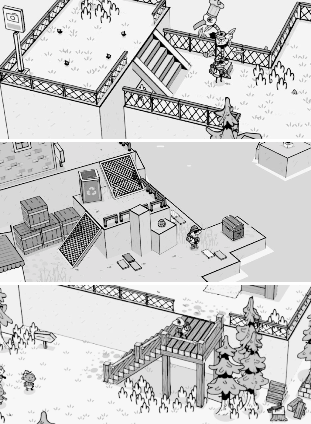
3 stylings of stairs — but always recognizable as connectors between levels.
UI DESIGN
4. Speech Bubble & Button Prompts
There is a speech bubble on top of the characters you can talk to in the world. From a distance, it has 3 dots against a white background, which makes it stand out against a busy & grey environment.
The button prompts appear when you are close enough to interact with things. Making it clear that you are close enough and what button to press. Leaving no room for ambiguity or confusion.

Speech bubbles on the skeleton & the dog. Button prompts when close enough.
5. Contrast
There is a speech bubble on top of the characters you can talk to in the world. From a distance, it has 3 dots against.
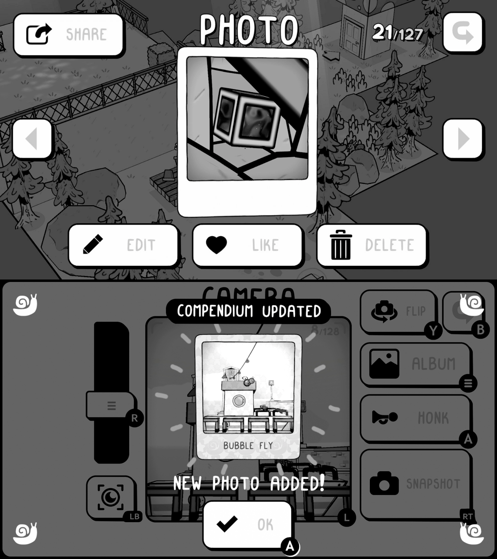
Clear contrast on menu items with white UI over a dark background + good use of icons!
6. Icons
There is also a good amount of icons used to explain what the button does. The icons used are very classic and simple shapes that we will have seen in other products before. There is an inherent understanding of these icons that helps the player quickly understand how things work.
If they created their own unique icons (that maybe had another narrative meaning or fit into the game world) they would have seen that the understanding of the UI would have been slower because players would have needed to learn the UI, instead of just understanding it.
IMPROVEMENTS
📷 I would have liked to see!
1. Text & icons contrast
Problem: The text on the buttons is too light, making it sometimes hard to make out because they are light grey with low contrast against the white buttons.
Solution: Making the text black, the same as the icons, would help with readability and make them look more harmonious together with the icon.
2. Icon updates
There are some inconsistent icon sizes that can be more even in their visual weight. So I adjusted that too in the example. (see before and after below)
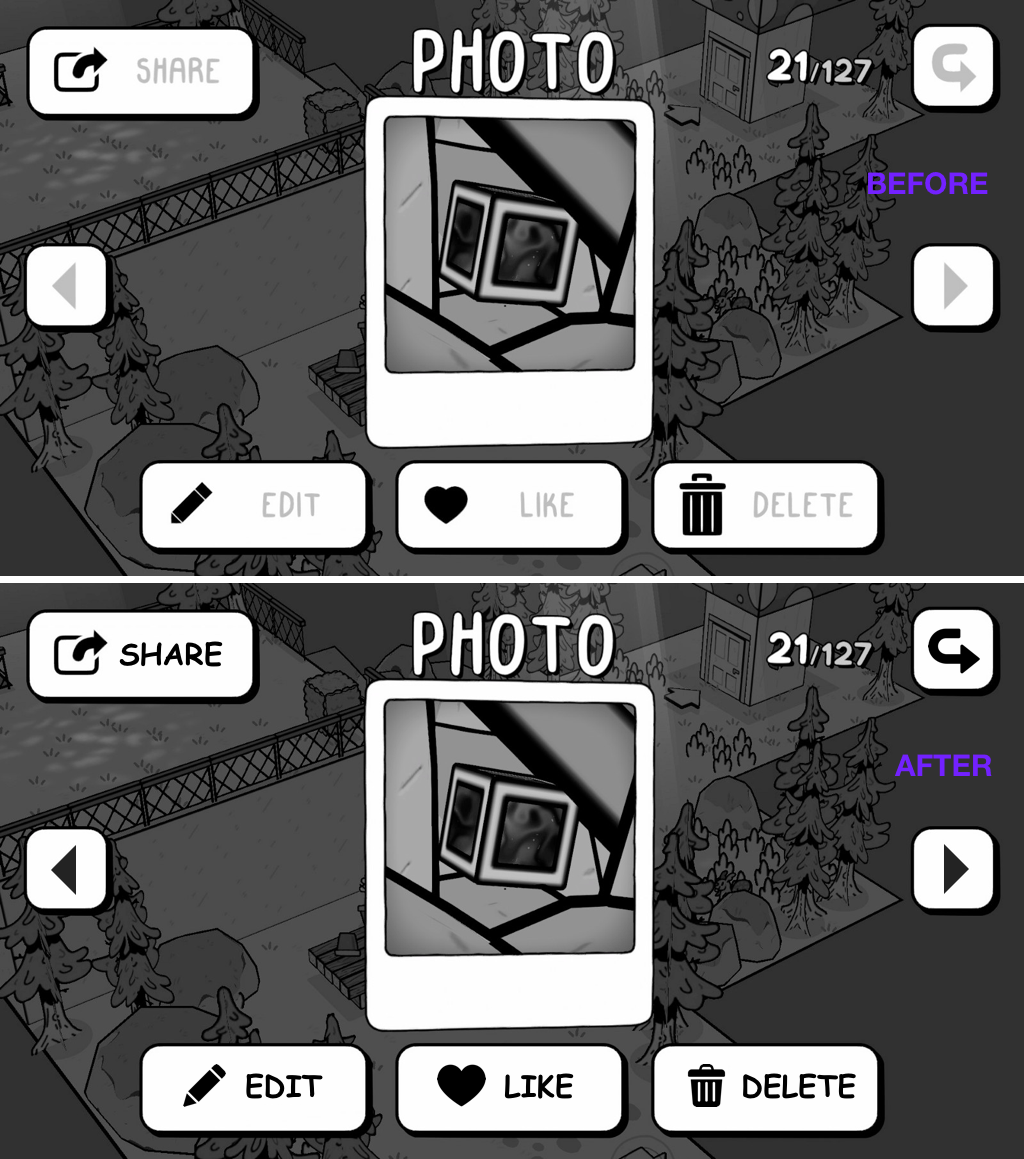
Before and After updated to the colors and Icon sizes.
Thank you for reading!
What did you think about this lesson? Please give me your feedback and questions through this link:
Check out the Website learngameuxdesign.com for more Game UX updates.
