Hello adventurer! Today’s quest takes us into space to learn about UX design from a scary game! I’m going to break down the UX design of the game Dead Space (the remake), its clever solutions & some improvements I would have loved to see!

🚀 What is the Dead Space Remake?
Dead Space is a horror third-person shooter set on a giant ship drifting in space. It is a remake of a game with the same name from 2008.
Disclamer!
I was not involved in the making of Dead Space, so I don’t have insight into their creative direction, goals, intent of the experience, user research results, their technical, resorses or time constrains. Everything I write here is from the perspective of being a UX Designer on other games as well as having played the game.
THE GOOD UX
Health & Ability Power is a part of the character model
Dead Space is known for (at least to me) moving the character's Health on the character's 3D model, instead of having a persistent HUD. A smart and immersive solution to clearly give the player important gameplay information without cluttering up the visuals with a HUD around the screen. This works really well because the game is in 3rd person, and you can see the character at all times.

A big Health meter up on the character's back, and the Statis-bar is a small half-circle to the right.
Similar to the Health Meter, they avoided putting things on the HUD by instead moving it to the player character. Do you want to know how much Ammo your equipped weapon has? Just look at the weapon the character is holding when you are aiming. Do you want to know what controls you need to use when flying and how much oxygen you have left? You can see this just above the Health meter on the back of the character!

Follow the Light
All things of interest and that can be interacted with have a glowing light on them. This can be a small colored light on items, or a big holographic. This is great in Dead Space because the game is very dark, so this is a great way to make them visible.
Turquoise color on items you can interact with, open, or pick up.
Turquoise Glowing Holographics.

Light is used to highlight paths and areas of interest.

Glowing lights on Explosives and Lootboxes.
Guiding AR “Arrow”
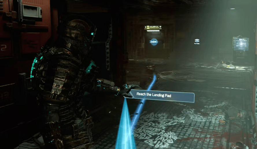
With all the tight corridors, dark hallways, and scary corners, you can easily get lost. Especially since Dead Space doesn’t have a mini-map constantly on the screen. But with one button click, you can get a “arrow” with light to guide you to in the direction you need to go!

The guiding system shows what path and door to take to your next objective.
Door Signs
Signs labeling the different doors across the station help you navigate. Giving an extra nudge for special awareness and navigation.
They use a good combination of icons and text to give environmental clues and add to the storytelling of the game’s world.

Highlight Room + Guide to next Objective
The map is spacious and clear to see where you are. The room you are in is highlighted, and you can freely move it up/down/left/right to see more of it. It also has a guiding line to show exactly what direction and which door you need to go to!
This would have been worse and tedious if you had to find the Objective icon on the map and then figure out how to get there. That would have been a strain on the player and lead to many more confused and frustrated players. You want to play and experience the game, don’t take a course in Map reading!

In a stressful situation, you don’t want to lose because you couldn’t remember what buttons to use. Dead Space is good to give you the button prompts in a good location that is close to the content you are looking at (you don’t need to go search for them). Yes, sometimes they can be a bit small and difficult to see because of the added effects (see this in my suggested improvements below,) but I could not complain that I got stuck on what buttons to use to play the game.
Clear Door States
They are good at Telegraphing from far away the door states. You don’t need to get up close to it or interact with it to know if you can open it or not. The game changes the color, text, number, and icon to show how you can interact with it!
Red + Icon + Text = Locked: You need to do something to open it. (add power, or get higher clearance.)
Blue: Can open it/unlock it.

Tutorials
There are several things that Deas Space explains to you in very good Tutorials. Since it’s a single player, they can slowly show the player new concepts and features.
Let’s look at how Dead Space introduces the player to how to effectively defeat monsters!
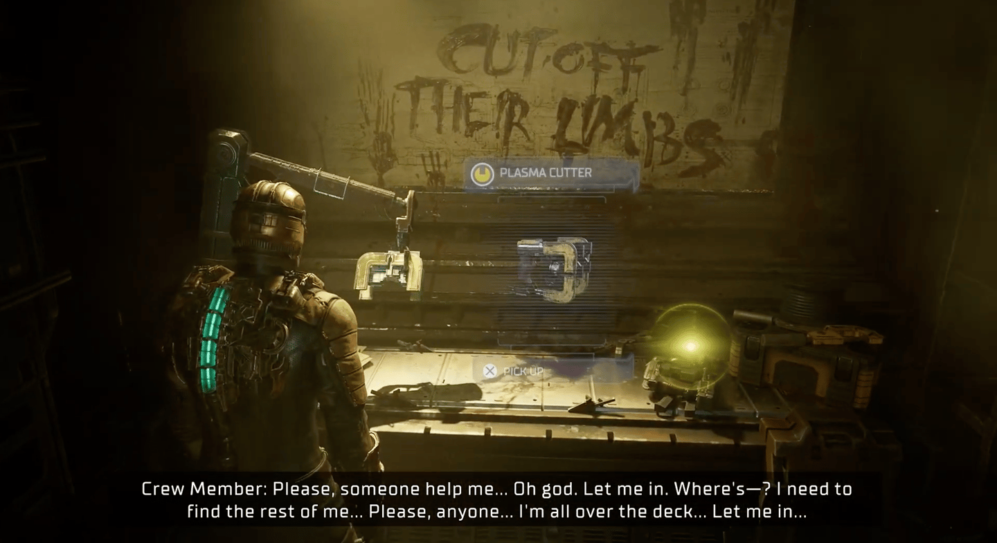
[Read] It starts when you find the first weapon with a text on the wall to: “Cut off their Limbs”.
[Listen] Audiolog: Interacting with a terminal plays an audiolog that tells you they had to cut off the monster’s arms & legs to make it die.
[Listen] One of your crewmates has a conversation with you about how to defeat the monsters, aka “Cut their Arms & Legs off!”
[Action] The monsters have very clear animations when you hit the limbs like the game wants you to. Shooting their arms off takes away their main weapon of attack. While shooting their legs off makes them fall, and they can only move a lot slower towards you.

Did you notice how all these things were a part of the storytelling of the world and that they was introduced to the player in different ways? This is a great way to tell players how to play the game at the same time as making them more immersed in the game world and story.
Homework: If you play the game or watch someone play/stream Dead Space, can you identify how the game introduces and explain how to use the Stasis Module tool?
Difficulty Level
I don’t usually play a lot of horror games, so I love it when they offer a range of difficulty levels! We all have different levels for what is challenging for us and what type of challenge is seen as fun.
Bonus: Since they don’t have the option to skip certain difficult enemies or parts of the game, you can instead turn down the difficulty to complete it a little easier. Instead of getting too stressed or frustrated if this was not available.
Texts
The Menu text sizes of Dead Space are good from the start. Subtitles are ON by default, and they have Speaker Tags (the name of who is speaking), Speaker Tag color, a big default size, and options to increase the size of the Subtitle text. All great things!
Content Warning
Some scenes in the game can be especially gruesome for players with PTSD. Although the game is a horror game famous for its body horror, it is very appreciated to have this option to warn players so they can prepare themselves before they suddenly encounter a potentially triggering scene.
You can also choose to blur out gruesome scenes, which is a great option for players who don’t want to see it in full detail.

Content Warning message in the top right HUD corner
Large selection of Accessibility options
Watch Steve Saylor's video for a great look at all accessibility options offered in Dead Space. He details everything and gives good reasons why he thinks the options are necessary and who would benefit from them.
Setting Options: https://www.youtube.com/watch?v=x9Shm9H1usQ
Accessibility Review: https://www.youtube.com/watch?v=PhVZ9jFCo6E
IMPROVEMENTS
I would have liked to see!
Difficult to read UI
There were some cases within the Map, Inventory, and description texts that I think could have been made clearer to read.
The low contrast of the blue backgrounds, with quite low opacity, and with some holographic effects that made the texts blurry. Makes it hard to read when you are stressed (being chased by monsters does that to you).
I wish they had left the blurry and glitchy effect on only environmental texts and menus, and kept the Menu UI more crisp & clear. It does feel straining on my eyes after a while looking through the inventory UI.
There are UI that is attached to items in the world that is sometimes not straight to you (depending on your angle to the object). This adds an extra level of difficulty to see it clearly, so I would have liked to see some improvements to the clarity & sizes here.
Saying all that, I really like how the game consistently kept screens, UI, and information in the game world, rather than on the HUD. It made the game immersive, kept the tension up while being in menus and didn’t take you out of the experience.

High Contrast Mode
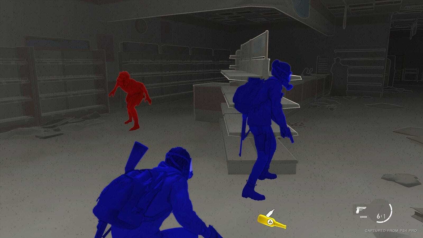
In the game ‘The Last of Us’, they added a High Contrast Mode for players with visual impairment. This would be great in Dead Space as well because the game’s very dark, and very low contrast, and the environment is all dark too.
The Last of Us is also a single-player horror game where you are chased by scary monsters. The Last of Us developers got a lot of praise for this addition to the game because it meant that a lot more people could play the game. They could actually see what was going on, what was a monster, and items they could pick up/interact with. I think this would work great for Dead Spac too.

High Contrast Mode in The Last of Us. Background is a monochrome grey, Enemies red, friendly characters blue and item pickups yellow.
Enemies should make more sounds when off-screen
As it is in Dead Space right now, the enemies sneaking up on you do not make as much sounds if they are not within the visual view of the screen. This means that it is very easy to get snuck up on by an enemy because you didn’t have the view pointed in their direction. Making for more jump scares when there is suddenly a creature next to you, but it also makes it harder for players who could have used the audio to be aware of what’s around them.
I also think hearing scary creature sounds all around you would make the game scarier (not just the ambient sounds they have now). This might just be a designer choice that the creators decided fits Dead Space. But this is my ‘wish’ list, so I’m keeping it!
Thank you for reading!
What did you think about this lesson? Please give me your feedback and questions through this link:
Check out the Website learngameuxdesign.com for more Game UX updates.

